Responsive Web . Branding(Online & InS)
HOKA Membership
My role: Product Designer & Creative Designer
Teams: UX & Creative
Project overview
Project Background
• Launch membership program as a Phase1 for data capture and value exchange
• Increase % of email opt-ins and account creation
• From data capture, user journey audits, and research, develop a roadmap that bridges between lightweight membership program and the long-term robust program
High-Level Design Goals and Objectives
• Design & develop long-term HOKA Loyalty program strategy & align on phased approach
• Development of DECKERS Strategic Plan (long-term)
Research
Competitor Analysis
I began with a thorough competitive analysis to assess the strengths and weaknesses of our competitors:
Salomon.com
Offers early access to sales similar to UGG Closet.
Uses email communications for member-exclusive events.
Provides opportunities to personalize membership landing pages.
On-running.com
Utilizes community-centric language and imagery.
Highlights "Grant" as an outlet for engagement.
Features clear FAQs for enhanced user experience.
Nike.com
Provides a "Stylitics" feature for styling purchases.
Uses targeted emails showcasing products and styling options.
Distinguishes between membership and account entities.
Clearly communicates value propositions through iconography on site and in emails.
Offers a personalized member shop for tailored experiences.
Philosophy.com
Maintains a clean and straightforward landing page for clarity.
Adidas.com
Includes a member-exclusive Product Listing Page (PLP).
Hosts members-only sales during designated "Members Week."
Prominently features value propositions at the beginning of activation emails.
This analysis provides valuable insights into how competitors leverage various strategies to enhance member engagement and customer experience across different platforms.
Journey Map
After conducting a thorough competitive analysis, I crafted our comprehensive journey map, outlining the stages our customers typically go through:
Awareness: When customers first become curious about HOKA.
Research: Deepening their belief in the value HOKA offers.
Find: Actively seeking and locating products on their terms.
Evaluate: Assessing how well HOKA products align with their personal goals.
Decide: Making the final decision on whether to make a purchase.
Within each stage, we included task flows, touch points, feelings, thoughts, pain points/barriers, and opportunities. This holistic approach ensures we understand and address every aspect of the customer journey, enhancing their experience with HOKA products and brand.
Touchpoints Map
Through collaborative workshops and a concerted effort, we achieved alignment and clarity across all teams, facilitated by this document.
The FigJam board serves as a central hub for participants, project leads, implementers, and viewers, aiming to:
Serve as a source of truth for user flows, project briefs, deliverables, and responsible teams.
Provide clarity on essential messaging requirements.
Function as a delivery board with previews of upcoming milestones and outputs.
From left to right, our focus spans from the top to the bottom of the funnel. The primary objective of this exercise is to identify existing ecommerce mentions of Shipping and Returns, given that Retail is a relatively new area for HOKA.
This document communicates multiple aspects and evolves with each phase of the project:
Visual Flow Audit
Touchpoints often involve multiple flows. We conducted an audit to ensure we capture all instances of shipping and returns, as well as opportunities where promoting membership would be beneficial.
Project Briefs
Teams communicated the rationale behind the direction of messaging or creative assets required. This provided context and ensured a cohesive execution that resonates with the user. By referencing visual aids within the request and understanding its placement in the flow, we minimized guesswork across execution and implementation teams.
Mockups w/links to deliverable file
Mockups undergo review and updates within the document.
Upon approval, relevant notes and delivery links are documented.
Membership Logo
Consistent visual recognition not only reduces cognitive load but also strengthens the perception of mission, idea, program, or message trustworthiness and personality. Maintaining the elevated and consistent look of the HOKA Membership lockup, including precise proportions and perceived spacing, will contribute significantly to the program's overall success.
Coming to life…
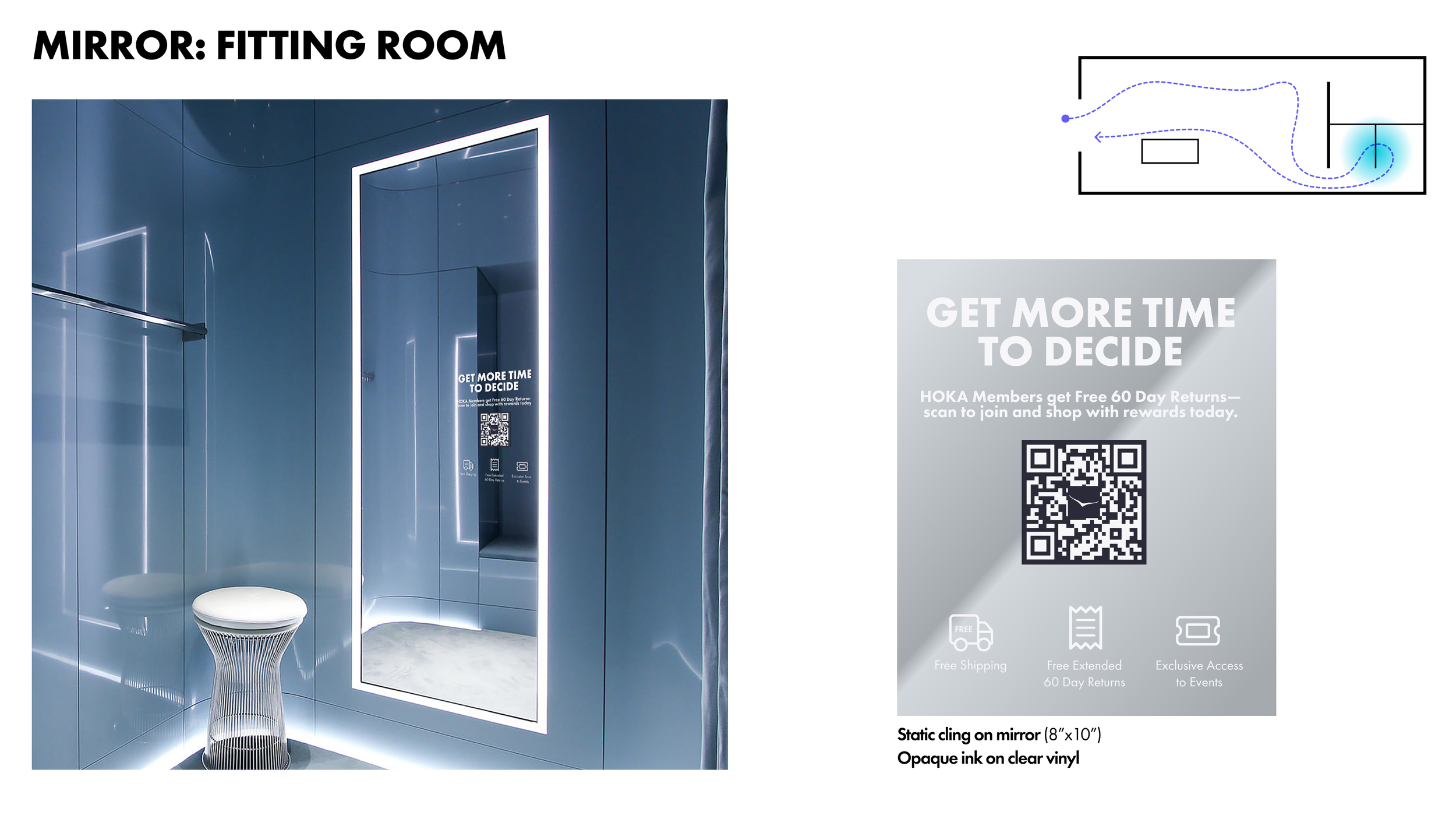
The main places for the membership logo include in-person interactions, email communications, online platforms, and in-store signage.
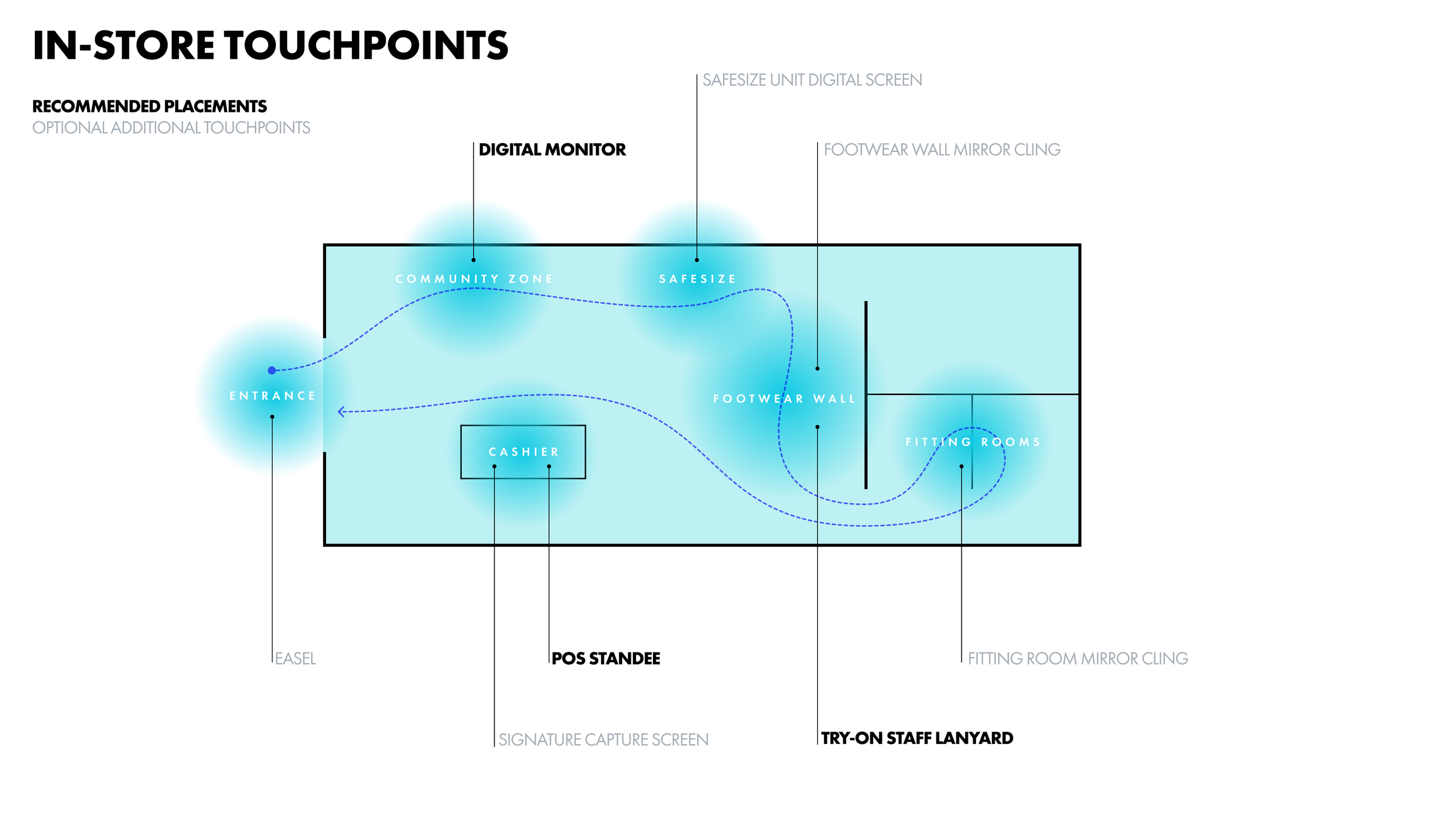
In-Store Signage Research & Touchpoints
I began by researching our competitors' in-store membership/loyalty programs to gather insights. This included examining various approaches and strategies used by:
Nike
Sephora
Foot Locker
Our Approach
Optimal Placements: Determine the best locations within the store and justify why these areas are ideal for signage.
Message Strategy: Define the messaging for each placement and explain the rationale behind it.
Disruption Assessment: Evaluate how disruptive each message might be to the shopping flow and consider adjustments if necessary.
Quick Research
Proposed Ideas
Prototype
Building upon the wireframes and visual components I previously developed, I meticulously identified touchpoints for each section. This informed the creation of the HOKA Membership Landing page and corresponding banners, strategically covering critical areas such as the Homepage, pop-ups, Product Listing Pages (PLP), Product Detail Pages (PDP), email communications, and social media platforms. Each element was designed with careful consideration to ensure cohesive branding and effective user engagement across all channels.
USABILITY TEST
During the initial three weeks of its launch, Phase 1 of the membership program has achieved notable milestones in customer relationship management (CRM):
56% of CRM database signed up for membership.
19% of opted-in users enrolled in membership.
Traffic and Engagement:
70% of total traffic to the membership site originated from CRM channels, including email newsletters, transactional campaigns, and SMS welcome series.
Performance Improvements:
A significant 51% increase in traffic from the Email Welcome Series to the Shoe Finder, following the introduction of the new membership layout.
Footer Updates:
Updated footer with SMS sign-up replacing "FYI FOR 30" CTA, resulting in a +16% increase in conversion rate compared to the average.
Highlights & Opportunities:
Highlight: Capture rate significantly increased in Q4 after adjusting enrollment language to include the word "free".
Opportunity: No Members-only activations in Q4; opportunity to enhance engagement and acquisition in Q1 with additional rewards incentives.
These achievements highlight the successful initial rollout of Phase 1 of the membership program, demonstrating robust engagement and conversion metrics driven by effective CRM strategies.
Reflection
Choosing the right words holds immense power in shaping user interactions and communications. Language plays a pivotal role in influencing how users perceive, engage with, and ultimately respond to information, products, and services.
A compelling example of this influence is evident in the significant increase in capture rate experienced during Q4. This surge followed a strategic decision to refine the enrollment language, specifically integrating the term 'free'. This simple yet strategic adjustment not only attracted a larger pool of prospective members but also streamlined the enrollment process.
By communicating the membership's benefits with the word 'free', we effectively removed potential barriers and heightened perceived value. This approach resonated positively with our target audience, resulting in higher conversion rates and a more favorable response overall.
This success underscores the transformative impact of language in driving user behavior and enhancing engagement. It highlights the importance of thoughtful, strategic language choices in optimizing user experiences and achieving organizational goals.


